You're Doing UX Writing? What's That? (Finally I Can Answer It)
目录
- You’re doing UX writing? What is that?
- UX writing or copywriting?
- Doing UX writing is easy and hard
- Collaboration? No, it’s compromise
- Summary
I was into software product operations for around five years. Product operation is to make the product development process easier for the product team and help build user-friendly products. The company I’m currently working for includes UX writing into the work content of product operation, aligning with user research and user data analysis, so as to efficiently ensure the product is user-friendly.
It has been three years since I wrote my first UX copy. Yet till recently I’ve retrospected for the first time what I had learnt and experienced in UX writing. No specific guidelines, writing techniques or standards are covered.
You’re doing UX writing? What is that?
UX writing is to write texts in the user interface of a software product (e.g. an app or a website). This can include the title bar texts, page titles, descriptions, notifications, tooltips, error messages, and even control labels.
The task of UX writing is to guide users through this software with crafted words. My ultimate (sometimes impossible) mission is to make the software easy to use.
UX writing or copywriting?
Broadly speaking, UX writing is indeed a kind of copywriting. Essentially they are both about crafting words and conveying certain messages to readers. The major difference, at least from my personal experience, is that you have fewer chances to write long sentences when doing UX writing, and the chances get even fewer when it comes to paragraphs. Compared to copywriting, UX writing has less to do with writing.
Doing UX writing is easy and hard
Thanks to the internet, I can easily find many blog articles talking about UX writing, and some of them are very good. These articles not only provide us a comprehensive view of UX writing, but also specific guidelines, good examples, and best practices. Living in a digital era, we’re standing on the shoulders of UX writers all over the world.
I’ve written copy for several web applications and two mobile applications. Below are some practices that I found work very well in my UX writing.
Be consistent
Never use different words to refer to the same feature. Inconsistency creates confusion. This confusion could even create a ripple effect especially when your application offers multiple languages. You’d never want to experience that.
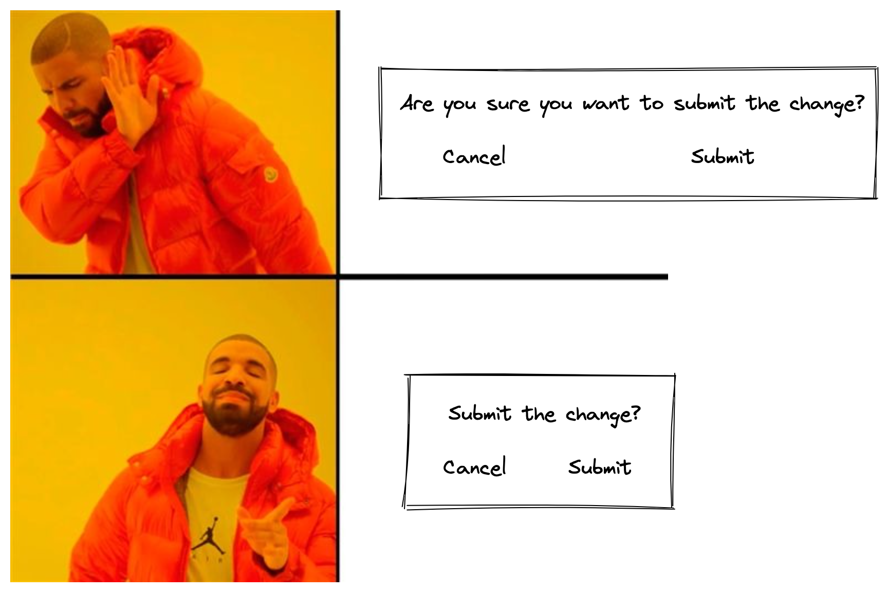
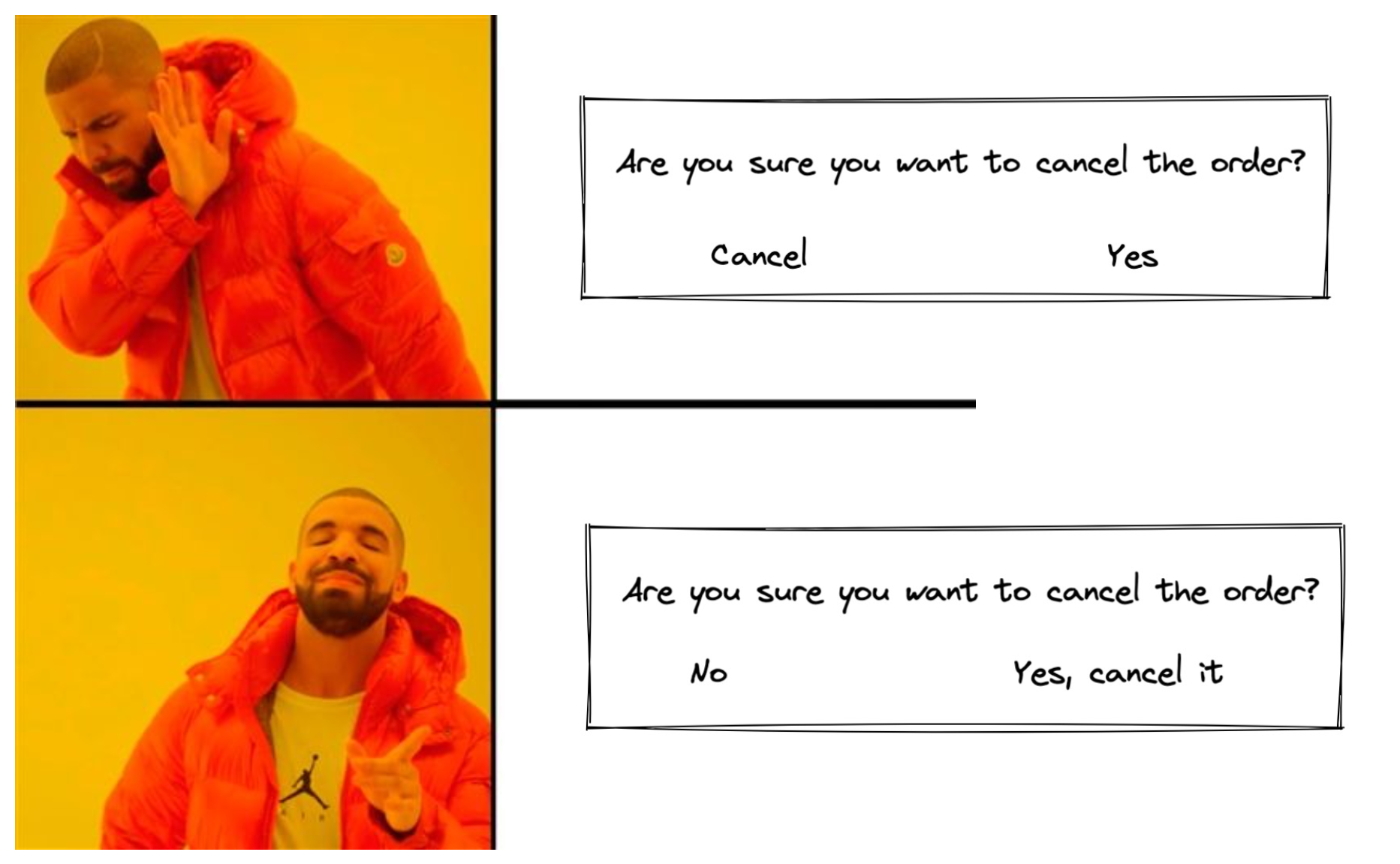
Be concise and clear
Remember that users are using an application, not reading an article. Normally they won’t spare their attention to any texts unless they’re doing some configuration or encountering an error. After all, the digital space might be infinite, but the size of our phone/computer screen is not.
Keep it concise

Avoid ambiguity

Be plain and simple
Use jargon only when necessary. Use plain and simple words. Focus on what users can do, what this can do for them, and what they need to do. It’s guiding users through an application, but not giving them a math or coding class.
Though UX copy appears simple on the surface, doing UX writing is not that simple. As some senior UX writers , it requires the knowledge of design principles, technical skills, and a deep understanding of your product and of user needs. However, if you ask me what’s the most challenging in UX writing, I’d say the cross-functional collaboration. And there’re always a lot.
Collaboration? No, it’s compromise
When doing UX writing, probably I just need to spend around 30% of my time writing words. 50% is spent collaborating with developers, UI designer and product manager.
Developers often think of texts as something only to explain what they have developed. The problem is, UX writing is NOT technical writing. Technical writing is writing for systems, which focuses on what systems can and cannot do, while UX writing is writing for users, which is about what systems can do for them and what value the system will bring them.
UI designers hate long sentences, as which “degrade” their design. They believe illustrations speak louder than words and a good graphical interface is clear enough to guide users through the product.
As for product manager, sometimes they believe (from nowhere) there’s an invisible bond existing between them and users, with which they need no word to understand each other. Hence, textual explanations are not that necessary, but more like the strawberries on the cake.
What’s about the rest 20%? I hear you’re asking. The rest 20% is normally reserved for my legal and marketing colleagues. They’ll look into the copy, and, if needed, give their advice as well. As they don’t involve in the development process, usually we’ll prepare a demo for them. This way, they can better understand how our new feature/application works and interacts with users.
Simply put, for my years in UX writing, I’ve learnt more about negotiating, presenting, and perspective transformation than writing.
Summary
UX writing can be identified as the following:
- What to write: software texts that could be seen by users, including the title bar text, page titles, descriptions, notifications, tooltips, error messages, and even control labels.
- Purpose to write: use crafted words to guide users of different educational or cultural backgrounds throughout your software product with ease.
I like doing UX writing, and it hardly makes me feel bored. A software can be seen as composed of codes, graphical interfaces and texts. Codes make up its bones and organs, and graphical interfaces serve as its appearance, while texts form up its voice to speak with human users. Via UX writing, a software is enabled to “speak” in a more human way.
Users are not likely to perceive a bug, but they can always notice a typo. As Microsoft UX Guide states,
…This text is, after all, seen more frequently and by more people than perhaps any other type of technical writing.
